Maximizing the power of tech to deliver cheaper and more tailored legal service
Results
2x
Qualified leads submissions
3x
Conversion rate on landing pages
180%
Successful legal case evaluation
Maximizing the power of tech to deliver cheaper and more tailored legal service

Building a customer qualification system driven by a deep understanding of system constraints, delivering high conversion, and improving internal team performance.
As Founding Designer and Head of Marketing, I led the redesign of Chevalier’s web experience to improve product adoption, streamline customer qualification, and drive growth. I doubled ClaimCheck submissions, reduced unqualified leads by 28%, and expanded qualification categories from 4 to 12 — enabling smarter targeting, better user segmentation, and higher lead quality.
As Founding Designer and Head of Marketing, I led the redesign of Chevalier’s web experience to improve product adoption, streamline customer qualification, and drive growth. I doubled ClaimCheck submissions, reduced unqualified leads by 28%, and expanded qualification categories from 4 to 12 — enabling smarter targeting, better user segmentation, and higher lead quality.
What I delivered
Doubled ClaimCheck submissions after redesigning the form flow and CTA strategy.
28% reduction in unqualified leads by refining user segmentation and redesigning the qualification process.
Tripled conversion rate from landing to submission, driven by clearer UX hierarchy and messaging.
+200% growth in qualified leads through expanded qualification criteria (from 4 to 12 categories) and better targeting.
About Chevalier
Chevalier is a leading legal tech startup that leverages a data-driven approach to assess customer eligibility for employer compensation based on user input.
Their qualification tool, ClaimCheck, enables internal teams to thoroughly analyze customers' legal cases and provide personalized recommendations, ultimately assisting with legal representation in disputes.
Problem
Chevalier’s web app featured a disjointed user experience with unclear navigation, overwhelming forms, and complex workflows, leading to high website bounce rate and low conversion in the legal prequalification tool (Claimecheck).
67%
website bounce rate
Due to lack of transparency, poor navigation, and limited value in the website content, Adwords-driven leads bounced immediately upon landing.
52%
unqualified leads
Due to the limitation of the online prequalification tool
Frustrated sales team
High levels of frustration and employee turnover were caused by overworked teams manually processing a large volume of unqualified leads.

Conversion funnel
Who were we up against
Researching competitors helped me identify Chevalier’s direct rivals in the legal tech space: Hopkins and Cleverklagen.
Hopkins took a traditional approach, emphasizing expertise and specialization to target older German-speaking customers. In contrast, Cleverklagen adopted a modern design and communication style, appealing to younger audiences and non-German speakers.
Both competitors prioritized showcasing their lawyers with images and offered a detailed yet streamlined online legal case evaluation tool.

What our customer analysis showed
The majority of Chevalier’s clients were initially hesitant to hire legal counsel due to concerns about high costs and the low likelihood of securing a fair severance package. They wanted a clear estimate of their potential compensation before committing to legal support. Another common concern was the lack of personal interaction with an online lawyer, which led to decreased trust.

Hypotheses
#1
Product transparency
If the product offering is made clear and consistent across the web and app throughout the user journey, users will better understand the value proposition, leading to increased engagement, higher conversion rates, and reduced bounce rates.
#2
Professional evaluation
If both legal counsel and the client are provided with maximum context before their initial interaction, it will lead to more efficient and informed discussions, reducing the time spent on clarifications and improving the overall decision-making process.
#3
Personal contact
f the entire legal team is made visible and approachable, it will foster stronger client relationships, improve communication, and enhance trust, leading to more successful outcomes and client satisfaction in legal matters.
Professional evaluation
Shared context enables faster, more informed legal discussions.
Claimcheck
Claimcheck
The case evaluation tool is a key driver of user engagement, offering fast, free assessments. However, its initial scope was limited to standard termination cases, forcing users with more complex situations to seek clarification via phone or email — increasing friction and support load.
To address this, I collaborated with in-house legal experts to expand the tool’s logic to cover edge cases like verbal terminations, anticipated dismissals, and protected conditions (e.g. pregnancy, disability). I also embedded direct support options — such as phone calls and contact forms — within the tool flow, improving accessibility and reducing drop-offs.

Claimcheck: Original version
The simplest legal cases cases covered (no edge cases)
A lot of back-and-forth in lawyer x client communication
Limited transparency & Low trust in the service

Claimcheck: Improved version
Termintation & Termination Agreement included
Pregnancy, disability, special needs cases included
Options for direct contact added
Information architecture
Information architecture
In the new website structure, I focused on adding content that supported my pre-defined assumptions:
In the new website structure, I focused on adding content that supported my pre-defined assumptions:
Personal Touch
By featuring lawyers with profile pictures, I made the service feel more personal. Showing their faces, expertise, and a bit of personal information helped build trust and increased the likelihood of mandants commissioning the service.
Service Transparency
Offering detailed service descriptions, regularly updated blog content, and an FAQ section allowed users to better understand the service and the nuances of specific legal cases. Adding pricing models and a more versatile legal evaluation enhanced transparency.
Quality Design
A well-organized website structure provides a strong foundation for effective design and a satisfying user experience.

Chevalier sitemap
Chevalier sitemap
New UI interface that provides guidance
and amplifies trust
New UI interface that provides guidance
and amplifies trust
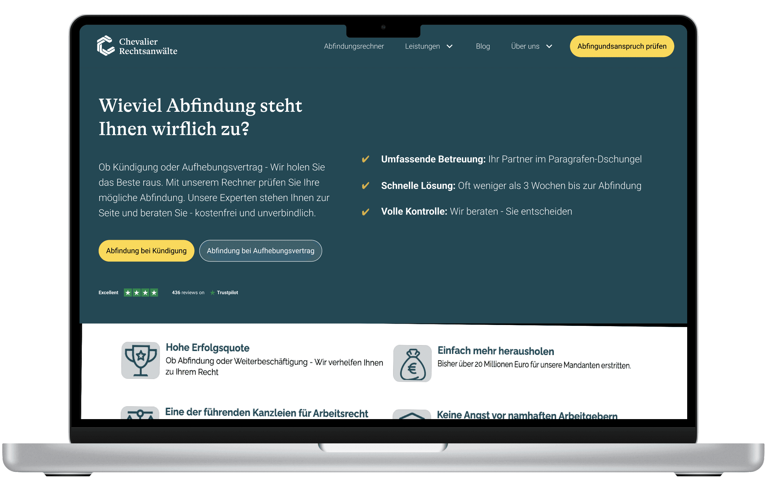
Visual design changes were a key factor in building trust for the digital legal service. I opted for a more traditional UI, using strong primary and secondary colors with contrasting accent colors.
Given the wide age range of the user groups, accessibility for people with visual impairments was a priority. The design also adhered to Usability Heuristics and Gestalt Design Principles to ensure a user-friendly experience.
About us
About us
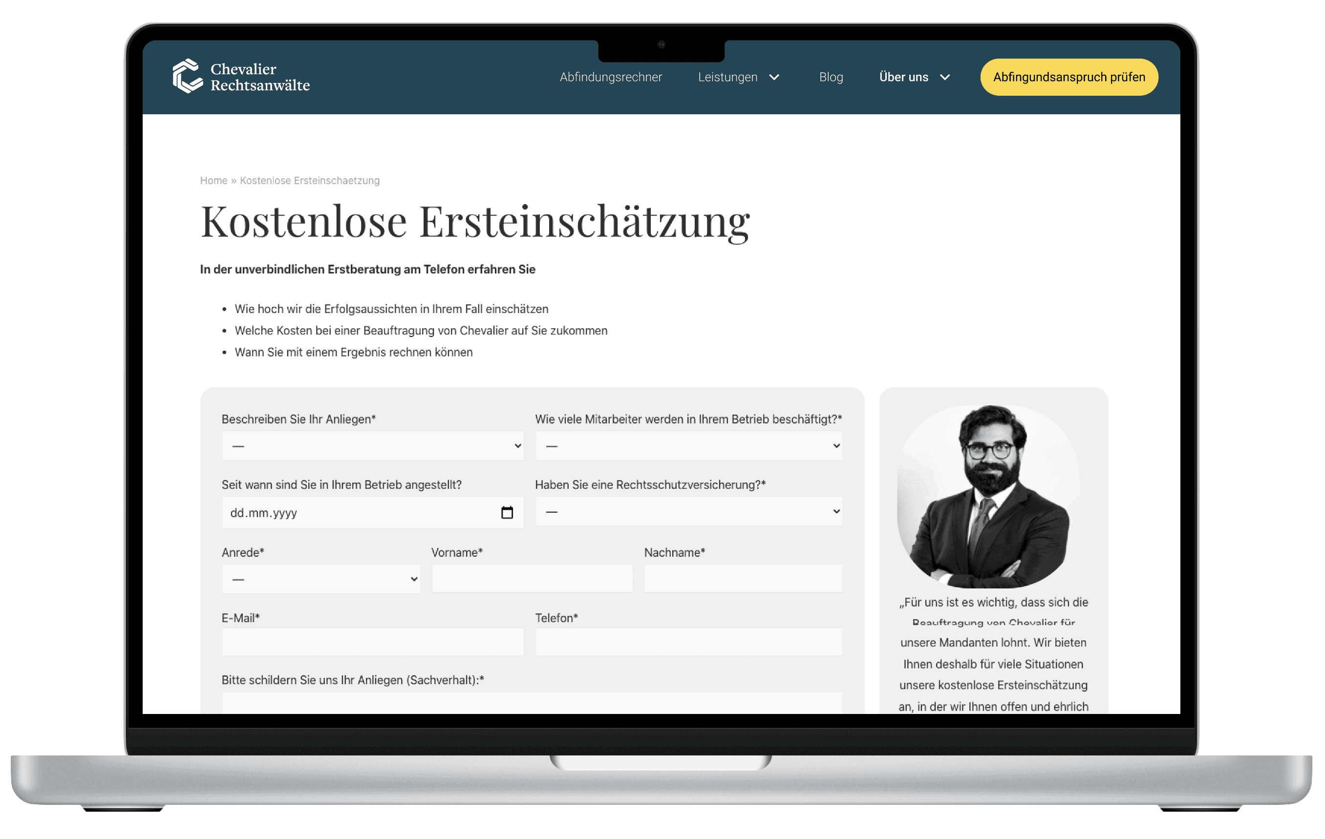
Showing a person behind the screen
Showing a person behind the screen
To enhance trust, I designed a dedicated page for each lawyer. Users can now see their assigned legal counsel’s photo, review their professional expertise, and check the languages they speak—directly addressing a key pain point of our persona
To enhance trust, I designed a dedicated page for each lawyer. Users can now see their assigned legal counsel’s photo, review their professional expertise, and check the languages they speak—directly addressing a key pain point of our persona


Blog
Blog
High expertise - being on pulse of things
High expertise - being on pulse of things
In the newly introduced blog section, I focused on expertise and service transparency. By providing relevant, regularly updated content, users can stay informed about key labor law trends (e.g., Kurzarbeit) and their impact on work and legal cases.
Additionally, high-quality content not only builds trust but also improves search engine rankings, making the service more discoverable on Google.
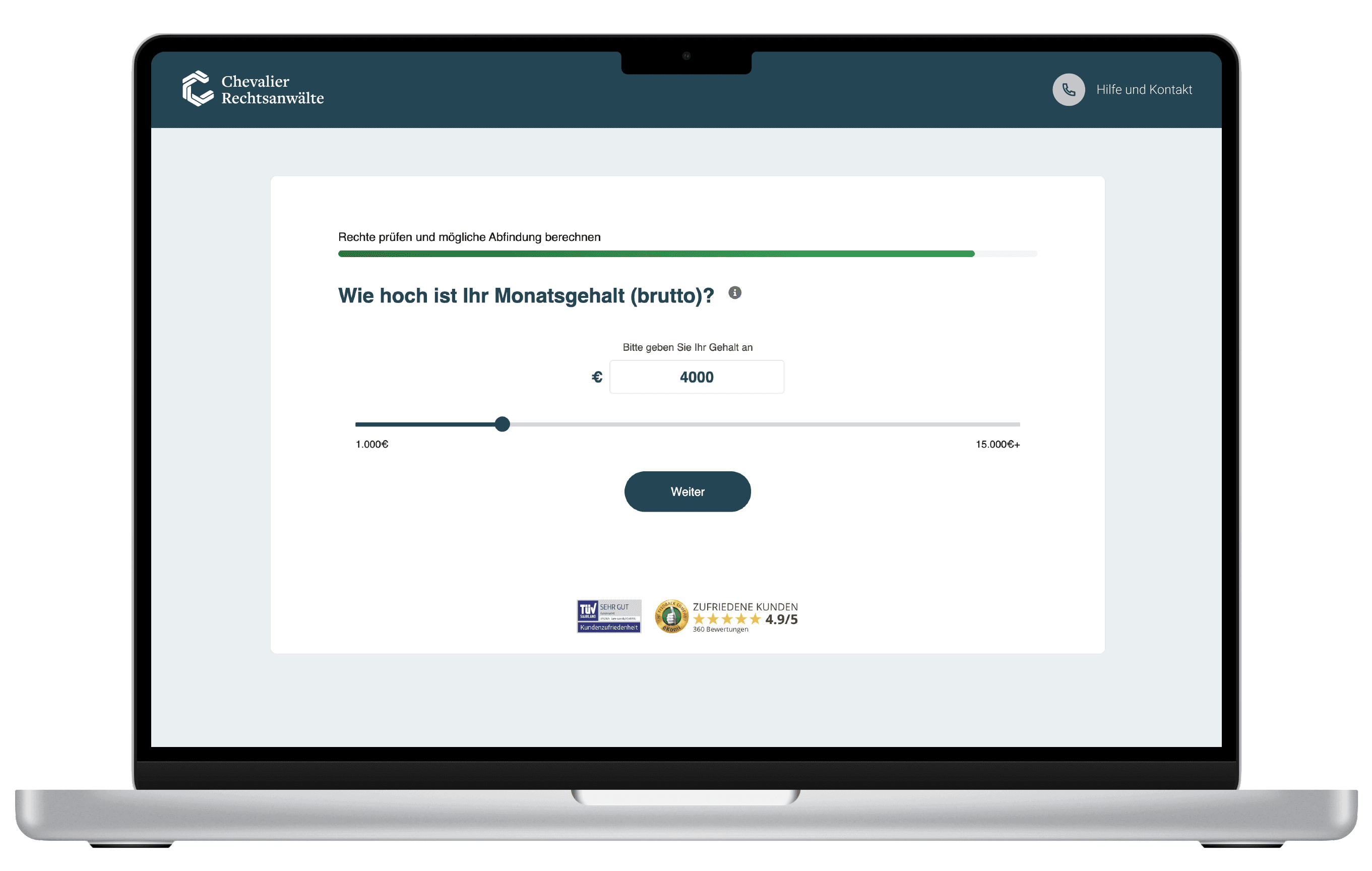
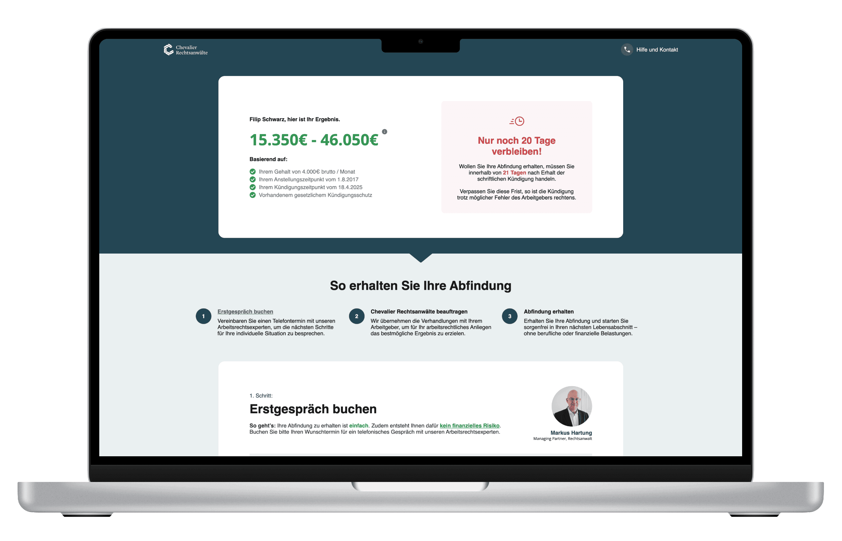
Claimcheck
Quick and trouble-free case evaluation
Even in the Claimchech, transparency remains a top priority. A progress bar is always visible, and every step of the desktop user flow includes an image of a lawyer with a short explanatory text for each question. Trust badges are also present across both desktop and mobile to reinforce credibility.
Setting up tracking events
Frontend events for website and web app
To accurately test our assumptions about website conversions and the Claimcheck, I led the setup of event tracking and data layers in Google Tag Manager. These events were structured into the following categories:
Website Conversions:
Website visit / Enter Claimcheck
Website visit / Finish Claimcheck (provide contact details)
Website visit / Finish Claimcheck (drop-off)
Website visit / Finish Claimcheck (disqualified)
Claimcheck Events:
CC start / CC finish (provide contact details)
CC start / CC finish (disqualified)
CC start / CC finish (drop off)
CC start / CC finish (special circumnstances)
Additionally, I tested the new designs through a series of usability tests across different stages of the user journey, from online ad variations and landing pages to legal case evaluation flows.
Product experiments & Usability testing
Testing web and app performance through hard data
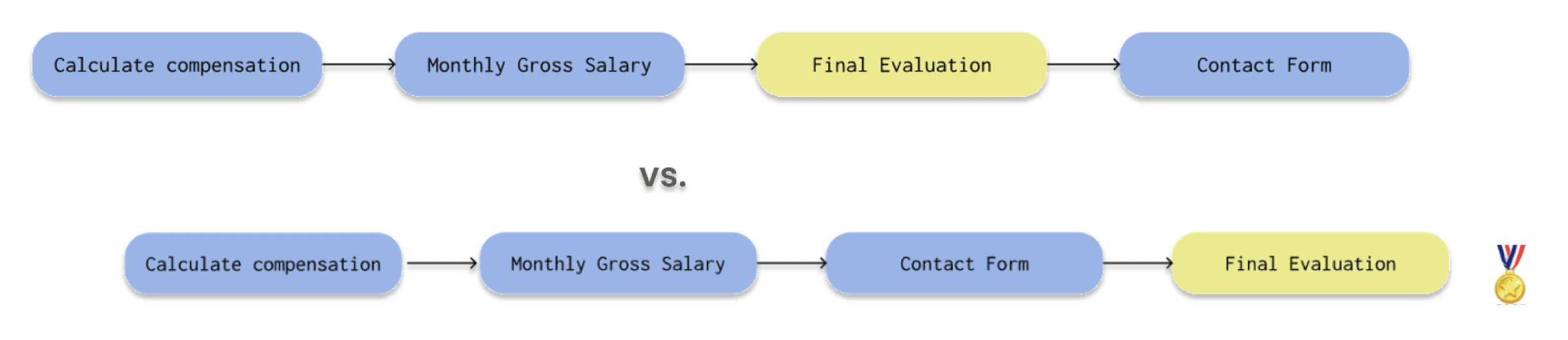
A/B test: Claimcheck vs. Contact form
A/B test: Claimcheck vs. Contact form
Context
There was concern within the team that the Claimcheck tool was overengineered, and that a standard contact form might convert more leads.
Objective
Increase the number of users who complete the online qualification for legal consultation via a simpler contact form.
Hypothesis
Replacing Claimcheck with a contact form as the main intake method would lead to more leads overall, resulting in a higher number of successful commissions.
Outcome
While lead volume increased, the operations team became overwhelmed, and there was no meaningful rise in successful commissions — revealing a quality-over-quantity issue.
Decision:
Keep Claimcheck as the main source of customer requests, placing the contact form into service page for specific use cases.
A/B Test: Different access point for Claimcheck
A/B Test: Different access point for Claimcheck
Context
Many users lacked a clear understanding of the service when contacted by the operations team, leading to false or unqualified leads.
Objective
Ensure users understand the service offering before receiving the first call.
Hypothesis
Creating a dedicated ad landing page—separate from the homepage or Claimcheck flow—will increase the number of informed users completing the case evaluation.
Outcome
Leads from the landing page converted into successful commissions at a rate 11% higher than those from the homepage.
Decision:
Establish landing pages as the primary entry point to Claimcheck. To improve their effectiveness further, additional iterations were planned.

A/B Test: Order of steps in Claimcheck (Contact prompt)
Context
Many users submitted fake or incorrect contact details, leading to wasted ad spend and extra work for the operations team.
Objective
Encourage users to provide accurate contact information.
Hypothesis
Presenting severance information before asking for contact details will increase user trust and improve lead quality.
Outcome
+32% increase in successful Claimcheck submissions with valid contact details.
+14% increase in service commissions.
Decision
Reordered the Claimcheck flow to show severance details before requesting user contact information.

Decision:
Reordered the Claimcheck flow to present severance information before prompting users for their contact details, improving trust and lead quality.
What we achieved
What we achieved
Through great team effort, we executed significant changes, including redesigning the website and app, optimizing the user flow, and improving trust elements. These changes resulted in increased progression across the user flow. The most notable improvements were seen in the top part of the funnel—website and the Legal Case Evaluation Tool—which was a major success. There's still room for further improvement, which should be driven by informed, user-centric decisions and strong cross-team communication.


Next steps
Next steps
Working on the product re-launch has been an incredibly enriching experience. It allowed me to leverage not only my product design expertise but also my growth hacking skills. By combining user-centric design with business objectives, we were able to create a solution that brings happiness to all parties involved—whether it’s the company or the user.
#1
Experiments and testing are routine at Chevalier. I'd focus more on optimizing LPs and the Legal Case Evaluation Tool.
#2
Synergy with legal and operations is key to great service, and user-centric workshops are vital.
#3
There was never enough time to develop a unified design system, which would be a valuable task to tackle in the future.
What I delivered
Doubled ClaimCheck submissions after redesigning the form flow and CTA strategy.
28% reduction in unqualified leads by refining user segmentation and redesigning the qualification process.
Tripled conversion rate from landing to submission, driven by clearer UX hierarchy and messaging.
+200% growth in qualified leads through expanded qualification criteria (from 4 to 12 categories) and better targeting.
About Chevalier
Chevalier is a leading legal tech startup that leverages a data-driven approach to assess customer eligibility for employer compensation based on user input.
Their qualification tool, ClaimCheck, enables internal teams to thoroughly analyze customers' legal cases and provide personalized recommendations, ultimately assisting with legal representation in disputes.
Problem
Chevalier’s web app featured a disjointed user experience with unclear navigation, overwhelming forms, and complex workflows, leading to high website bounce rate and low conversion in the legal prequalification tool (Claimecheck).
67%
Website bounce rate
Due to lack of transparency, poor navigation, and limited value in the website content, Adwords-driven leads bounced immediately upon landing.
52%
Unqualified leads
Due to the limitation of the online prequalification tool
Frustrated sales team
High levels of frustration and employee turnover were caused by overworked teams manually processing a large volume of unqualified leads.
Conversion funnel
Who were we up against
Researching competitors helped me identify Chevalier’s direct rivals in the legal tech space: Hopkins and Cleverklagen.
Hopkins took a traditional approach, emphasizing expertise and specialization to target older German-speaking customers. In contrast, Cleverklagen adopted a modern design and communication style, appealing to younger audiences and non-German speakers.
Both competitors prioritized showcasing their lawyers with images and offered a detailed yet streamlined online legal case evaluation tool.
What our customer analysis showed
The majority of Chevalier’s clients were initially hesitant to hire legal counsel due to concerns about high costs and the low likelihood of securing a fair severance package. They wanted a clear estimate of their potential compensation before committing to legal support. Another common concern was the lack of personal interaction with an online lawyer, which led to decreased trust.
Hypotheses
#1
Product transparency
If the product offering is made clear and consistent across the web and app throughout the user journey, users will better understand the value proposition, leading to increased engagement, higher conversion rates, and reduced bounce rates.
#2
Professional evaluation
If both legal counsel and the client are provided with maximum context before their initial interaction, it will lead to more efficient and informed discussions, reducing the time spent on clarifications and improving the overall decision-making process.
#3
Personal contact
f the entire legal team is made visible and approachable, it will foster stronger client relationships, improve communication, and enhance trust, leading to more successful outcomes and client satisfaction in legal matters.
Professional evaluation
Shared context enables faster, more informed legal discussions.
Claimcheck
The case evaluation tool is a key driver of user engagement, offering fast, free assessments. However, its initial scope was limited to standard termination cases, forcing users with more complex situations to seek clarification via phone or email — increasing friction and support load.
To address this, I collaborated with in-house legal experts to expand the tool’s logic to cover edge cases like verbal terminations, anticipated dismissals, and protected conditions (e.g. pregnancy, disability). I also embedded direct support options — such as phone calls and contact forms — within the tool flow, improving accessibility and reducing drop-offs.
Claimcheck: Original version
The simplest legal cases cases covered (no edge cases)
A lot of back-and-forth in lawyer x client communication
Limited transparency & Low trust in the service
Claimcheck: Improved version
Termintation & Termination Agreement included
Pregnancy, disability, special needs cases included
Options for direct contact added
Results
By accounting for multiple edge cases and designing flexible user flows, we tripled the number of Claimcheck outcomes, simplified communication with users, and doubled the number of qualified leads moving through the evaluation stage.
4 to 12
Claimcheck evaluation outcomes
+105%
Qualified leads in the Sales stage
-35%
Lead processing team
Product transparency
Consistent product messaging boosts clarity, engagement, and conversions.
Information architecture
In the new website structure, I focused on adding content that supported my pre-defined assumptions:
Personal Touch
By featuring lawyers with profile pictures, I made the service feel more personal. Showing their faces, expertise, and a bit of personal information helped build trust and increased the likelihood of mandants commissioning the service.
Service Transparency
Offering detailed service descriptions, regularly updated blog content, and an FAQ section allowed users to better understand the service and the nuances of specific legal cases. Adding pricing models and a more versatile legal evaluation enhanced transparency.
Quality Design
A well-organized website structure provides a strong foundation for effective design and a satisfying user experience.
New UI interface that provides guidance
and amplifies trust
Visual design changes were a key factor in building trust for the digital legal service. I opted for a more traditional UI, using strong primary and secondary colors with contrasting accent colors.
Given the wide age range of the user groups, accessibility for people with visual impairments was a priority. The design also adhered to Usability Heuristics and Gestalt Design Principles to ensure a user-friendly experience.
About us
Showing a person behind the screen
To enhance trust, I designed a dedicated page for each lawyer. Users can now see their assigned legal counsel’s photo, review their professional expertise, and check the languages they speak—directly addressing a key pain point of our persona
Blog
High expertise - being on pulse of things
In the newly introduced blog section, I focused on expertise and service transparency. By providing relevant, regularly updated content, users can stay informed about key labor law trends (e.g., Kurzarbeit) and their impact on work and legal cases.
Additionally, high-quality content not only builds trust but also improves search engine rankings, making the service more discoverable on Google.
Claimcheck
Quick and trouble-free case evaluation
Even in the Claimchech, transparency remains a top priority. A progress bar is always visible, and every step of the desktop user flow includes an image of a lawyer with a short explanatory text for each question. Trust badges are also present across both desktop and mobile to reinforce credibility.
Setting up tracking events
Frontend events for website and web app
To accurately test our assumptions about website conversions and the Claimcheck, I led the setup of event tracking and data layers in Google Tag Manager. These events were structured into the following categories:
Website Conversions:
Website visit / Enter Claimcheck
Website visit / Finish Claimcheck (provide contact details)
Website visit / Finish Claimcheck (drop-off)
Website visit / Finish Claimcheck (disqualified)
Claimcheck Events:
CC start / CC finish (provide contact details)
CC start / CC finish (disqualified)
CC start / CC finish (drop off)
CC start / CC finish (special circumnstances)
Additionally, I tested the new designs through a series of usability tests across different stages of the user journey, from online ad variations and landing pages to legal case evaluation flows.
Product experiments & Usability testing
Testing web and app performance through hard data
A/B test: Claimcheck vs. Contact form
Context
There was concern within the team that the Claimcheck tool was overengineered, and that a standard contact form might convert more leads.
Objective
Increase the number of users who complete the online qualification for legal consultation via a simpler contact form.
Hypothesis
Replacing Claimcheck with a contact form as the main intake method would lead to more leads overall, resulting in a higher number of successful commissions.
Outcome
While lead volume increased, the operations team became overwhelmed, and there was no meaningful rise in successful commissions — revealing a quality-over-quantity issue.
Decision: Keep Claimcheck as the main source of customer requests, placing the contact form into service page for specific use cases.
A/B Test: Different access point for Claimcheck
Context
Many users lacked a clear understanding of the service when contacted by the operations team, leading to false or unqualified leads.
Objective
Ensure users understand the service offering before receiving the first call.
Hypothesis
Creating a dedicated ad landing page—separate from the homepage or Claimcheck flow—will increase the number of informed users completing the case evaluation.
Outcome
Leads from the landing page converted into successful commissions at a rate 11% higher than those from the homepage.
Decision: Establish landing pages as the primary entry point to Claimcheck. To improve their effectiveness further, additional iterations were planned.
A/B Test: Order of steps in Claimcheck (Contact prompt)
Context
Many users submitted fake or incorrect contact details, leading to wasted ad spend and extra work for the operations team.
Objective
Encourage users to provide accurate contact information.
Hypothesis
Presenting severance information before asking for contact details will increase user trust and improve lead quality.
Outcome
+32% increase in successful Claimcheck submissions with valid contact details.
+14% increase in service commissions.
Decision
Reordered the Claimcheck flow to show severance details before requesting user contact information.

Decision: Reordered the Claimcheck flow to present severance information before prompting users for their contact details, improving trust and lead quality.
What we achieved
Through great team effort, we executed significant changes, including redesigning the website and app, optimizing the user flow, and improving trust elements. These changes resulted in increased progression across the user flow. The most notable improvements were seen in the top part of the funnel—website and the Legal Case Evaluation Tool—which was a major success. There's still room for further improvement, which should be driven by informed, user-centric decisions and strong cross-team communication.
Next steps
Working on the product re-launch has been an incredibly enriching experience. It allowed me to leverage not only my product design expertise but also my growth hacking skills. By combining user-centric design with business objectives, we were able to create a solution that brings happiness to all parties involved—whether it’s the company or the user.
#1
Experiments and testing are routine at Chevalier. I'd focus more on optimizing LPs and the Legal Case Evaluation Tool.
#2
Synergy with legal and operations is key to great service, and user-centric workshops are vital.
#3
There was never enough time to develop a unified design system, which would be a valuable task to tackle in the future.